
Case study · Language education
A clearer digital experience for language learners.
A website built for a German language centre to organise its information more clearly, support Arabic-speaking learners and make important content easier to explore.
Project
Language centre website
Organisation
German Language Centre
Audience
Arabic-speaking learners
Focus
Content & user journey
The challenge
Make the information easier to explore.
A language centre can have a lot to communicate, but learners should not have to work through a complicated website to find what matters to them. The challenge was to create a clearer experience around the centre's content and audience.
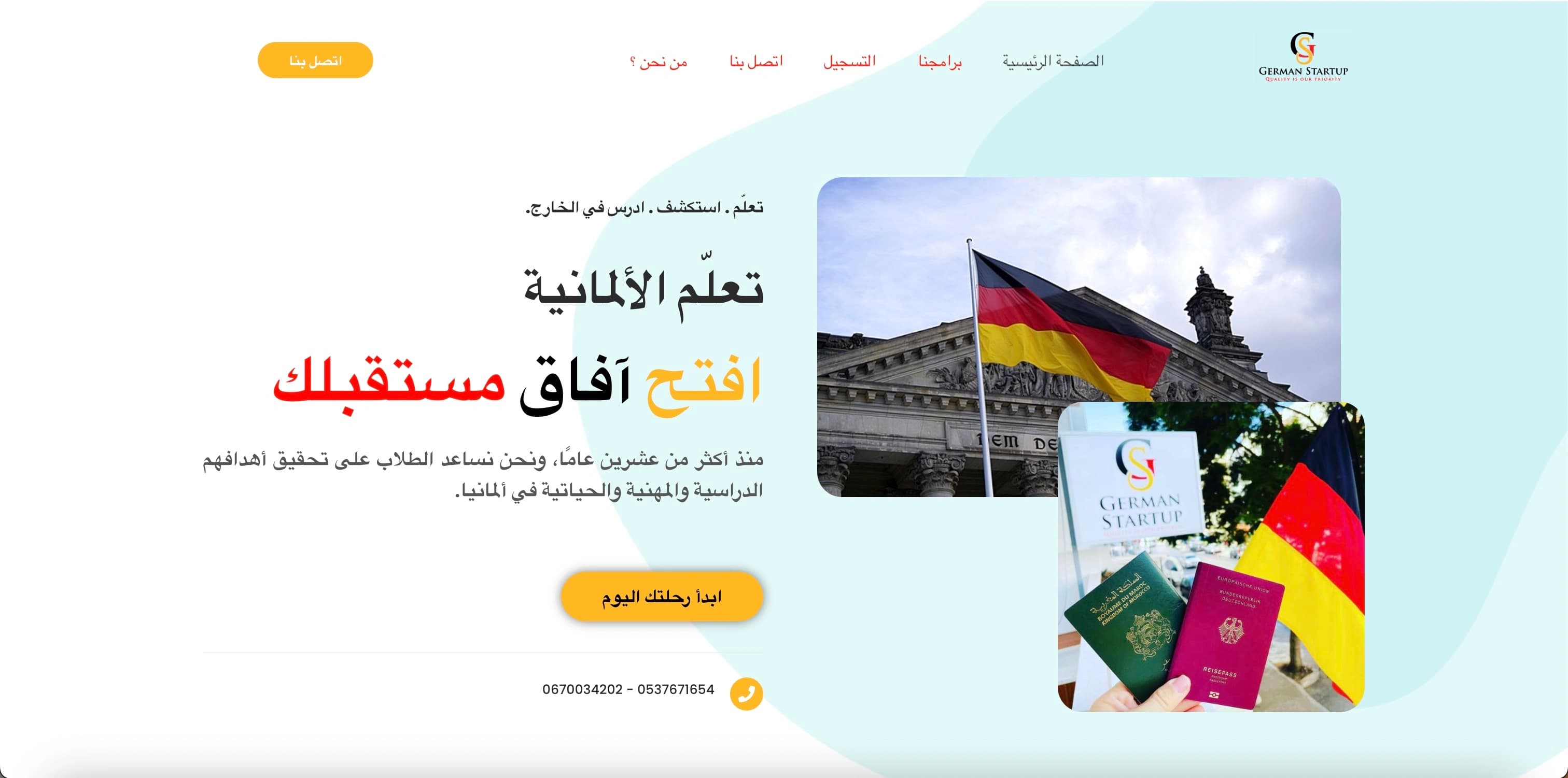
Organise the information more clearly
The website needed to present the centre's information in a structure that made important content easier for learners to find and understand.
Design around an Arabic-speaking audience
The experience needed to support Arabic content naturally, with the layout, reading direction and content hierarchy designed around the audience.
Create a simpler journey for learners
Visitors needed a clearer route through the website so they could explore the centre, understand the available information and know where to go next.
What we changed
Shape the experience around the people using it.
The website was designed around the needs of its audience, combining clearer content organisation with an interface suited to Arabic-speaking learners and the way they move through the site.
Content structure
A clearer hierarchy for the centre's information
Content was organised into a more deliberate structure so learners could move through the website without important information becoming buried or difficult to follow.
Arabic experience
An interface shaped around the audience
The website was designed with Arabic content and right-to-left layout in mind, allowing the experience to feel natural for the learners it was intended to serve.
User journey
Clearer routes through the website
Navigation and page hierarchy were kept focused so visitors could understand where they were, explore relevant information and move towards the next step more easily.
Responsive design
A consistent experience across screen sizes
Layouts were designed to adapt across desktop and mobile so the content remained readable, structured and easy to navigate on different devices.
Arabic experience
Arabic was part of the design from the start.
Supporting an Arabic-speaking audience involves more than translating text. Reading direction, hierarchy, spacing and navigation all influence whether the website feels natural to use.
Right-to-left by design
The interface was structured around right-to-left reading so navigation, content flow and visual hierarchy worked naturally with Arabic rather than feeling adapted afterwards.
Content given room to breathe
Spacing, hierarchy and page composition were used to keep information approachable, helping learners scan the website and understand how different pieces of content relate.
One coherent experience
The same visual and structural principles were carried across the website so learners could move between pages without having to relearn how the interface works.
The outcome
A website shaped around its audience.
The finished website brought the centre's information into a clearer digital structure, with an Arabic-first experience designed to make content easier for learners to navigate and understand across different screen sizes.
Have a project in mind?
Build a website around the people using it.
If your website needs a clearer structure, a better user journey or an experience shaped around a specific audience, tell us what you are trying to achieve.